The End of the Tacky Photo Card: How to Turn Your Camera Roll into Art
You know the card I mean.
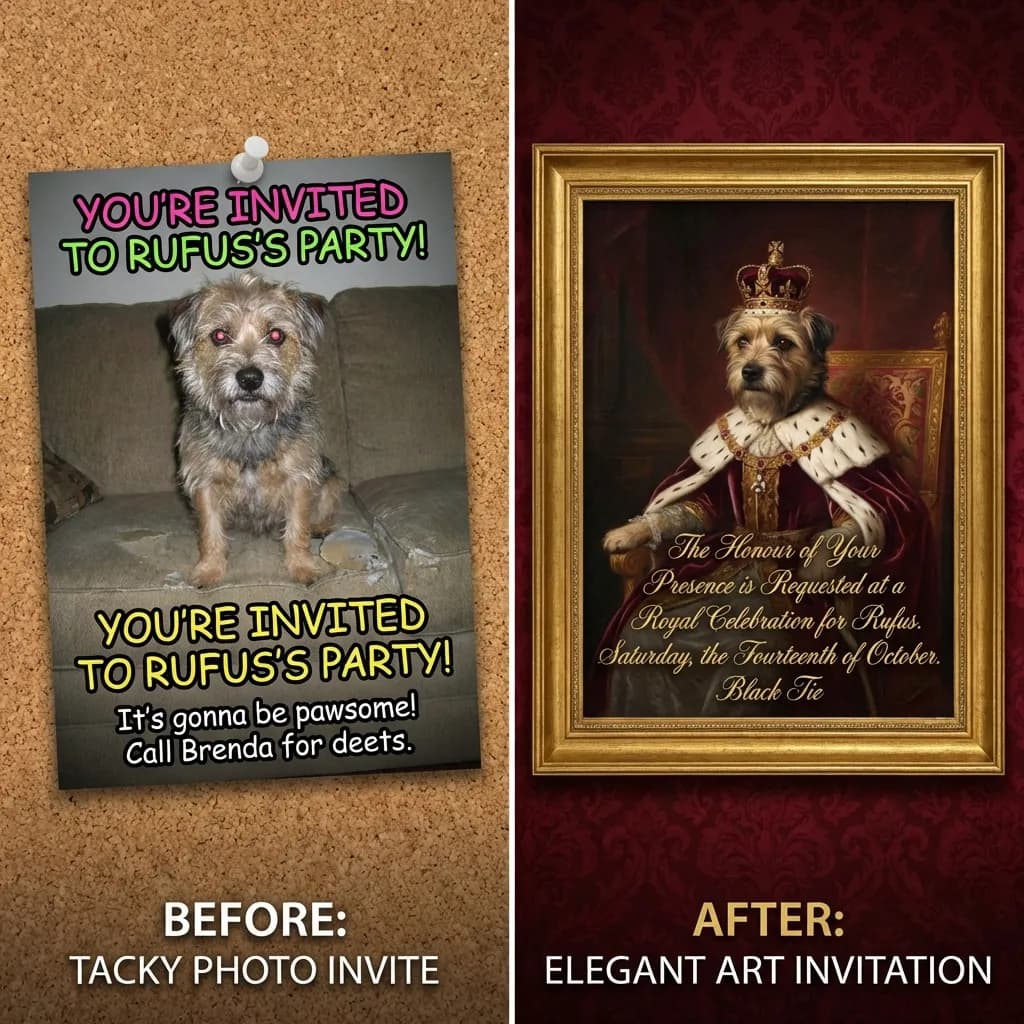
It shows up in the mail around the holidays or before a birthday, printed on glossy, flimsy cardstock with a family or a baby or a dog on it. The lighting is a little off and the crop is awkward, and the whole thing is dropped onto a pre-made template with a "Let's Party!" font that fights with the background.
You smile and say "aww, that's nice." It goes on the fridge for two weeks. Then it goes in the recycling.
I've been campaigning against the tacky photo card for years, and I finally have the tools to make my case. The fix is treating the photo as raw material instead of as the finished invitation.
Why Most of Your Photos Aren't Invitation-Ready
Here's the part nobody wants to admit: most of our photos make terrible invitations.
I love my kids and I love my dog, and there are thousands of pictures of them on my phone. But most of those pictures are cluttered, badly lit, or shot in three seconds before someone moved. That's what an actual camera roll looks like.
Take one of those everyday photos, drop it into a polished design template, and the seams show immediately. The colors clash and the resolution looks wrong against the crisp graphics around it. It reads exactly like what it is, which is a DIY project that got away from you.
For years the only real answer was hiring a photographer. But who's booking a photoshoot for a 3rd birthday party?
Use Your Photo as Inspiration, Not the Final Card
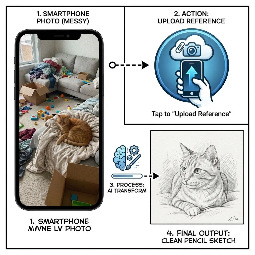
At Lemonvite we built a different way to put your photos to work. You upload an image as a Reference Image, not as the artwork itself.
The idea is that your photo points the design engine in a direction rather than becoming the whole card. You upload it, then describe how you want it reimagined. The engine reads the composition and colors, then redraws the scene from scratch in the style you asked for. It's closer to commissioning a quick painting from a snapshot than slapping a filter on top of it.
This is the same describe-it-and-it-builds-it approach behind why templates are dead: you direct the look instead of picking from a shelf. Here are three ways I use it to make invitations people actually stop scrolling for.
1. The Pet Portrait, Upgraded
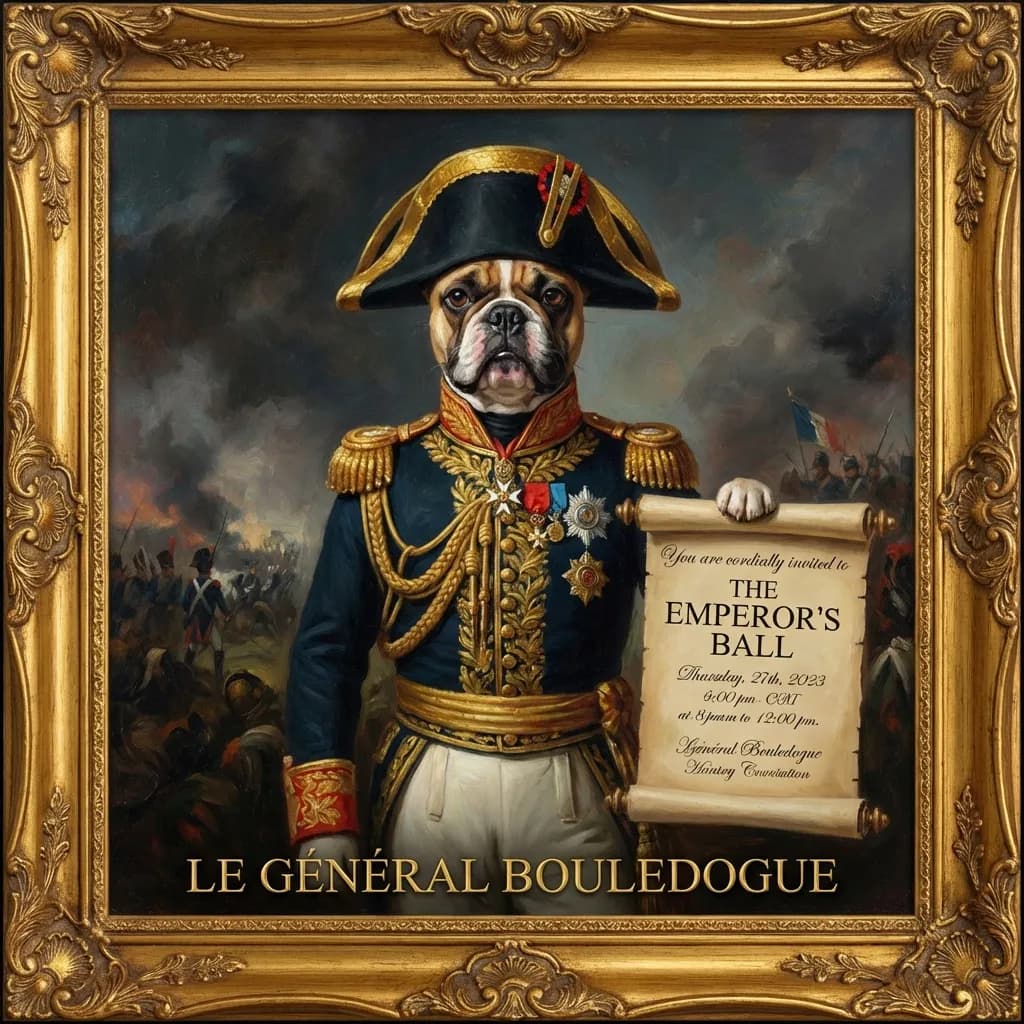
My friend Sarah wanted to throw a birthday party for her French Bulldog, Barnaby. She had one cute shot of him asleep on the sofa, but a laundry pile right behind him ruined the frame.
We uploaded the photo and described what we wanted: "A majestic oil painting of this dog as a 19th-century general, wearing a military uniform with medals, dramatic lighting, classical art style."
What came back was hilarious and weirdly dignified. The laundry was gone, replaced by a moody dark curtain, and Barnaby looked positively noble. It set exactly the right over-the-top tone for the party.
2. Turning a Plain Venue Into Atmosphere
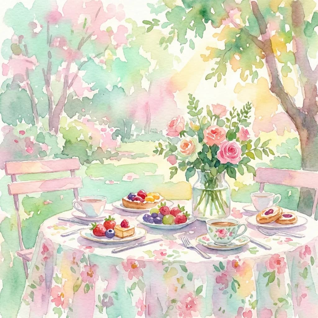
I hosted a garden brunch last spring. My backyard is perfectly nice, but in photos all you notice is the neighbor's fence and the hose reel by the wall.
I snapped a quick shot of the table anyway, then uploaded it with this: "A soft, impressionist watercolor painting of this garden scene, pastel colors, dappled sunlight, dreamy and romantic atmosphere."
Suddenly my average backyard looked like the setting of a romance novel. The hose reel dissolved into a smear of green and the fence became a soft wash of brown. The picture kept the feeling and dropped the gritty details.
3. The Stylized Portrait for the Birthday Person
For a 30th birthday you might want the guest of honor on the invite, but a straight selfie can feel a touch vain. So turn it into an illustration instead.
Upload the selfie and try "A vibrant pop-art portrait, bold colors, comic book style, half-tone dots." Or go the other way with "A minimal line drawing sketch, elegant, black and white, sophisticated." Either way the person becomes a design element on the card rather than a snapshot pasted onto it.
Tips for Getting a Good Result
A few things I've learned the hard way. The design engine redraws your image, but it still needs to read the shapes underneath, so start from a photo where the subject is clear and reasonably lit. Be specific about the style, too. "Make it art" gets you mush, while "pencil sketch," "oil painting," or "vintage travel poster" gets you something with a point of view.
And don't worry about the mess in the background. Clutter usually disappears in the redraw, the way that laundry pile behind Barnaby vanished into the brushstrokes without my asking. You can see the range of what this produces in our invitation design examples.
What Happens to Your Photo
I know the next question, because it's the first one I'd ask: where does my photo actually go?
Plenty of "free" apps quietly claim rights to whatever you upload. Lemonvite doesn't. Your reference image is used only to generate your design. We don't store it, sell it, or repurpose it, and once the design is generated the data is ephemeral.
You're the One With the Eye
You don't have to paint to make something that looks like art. You need a decent memory and a little nerve about how to reimagine it. It's the same reason you don't need a graphic designer for a party invite anymore.
So skip the tacky photo card everyone else is mailing. Go dig through your camera roll, find the funny picture of your partner or that sweet unposed moment with your kids, and turn it into the invitation on Lemonvite.